Evaluation on Prezi
Thursday 5 May 2011
Friday 1 April 2011
Music Magazine (Front Cover, Contents Page, and Double Page Spread)

Front Page

Contents Page

Double Page Spread
Sunday 13 March 2011


Wednesday 2 March 2011
Genre Choice
I am going to create a music magazine's front cover, contents page, and a double page spread for chart music. It's focus will be on the month's UK Top 40. As it will be focused on the UK Top 40, it will not be tied down to one particular genre - as the genre of music on the Top 40 can be anything, i.e. pop, rock, R'n'B, etc.
The contents page and the double page spread will be focused on the featured artist of the magazine. The artist will be created by me, and will therefore not be real. The contents page will feature another artist who is different from the artist on the front cover and contents page.
The contents page and the double page spread will be focused on the featured artist of the magazine. The artist will be created by me, and will therefore not be real. The contents page will feature another artist who is different from the artist on the front cover and contents page.
Monday 28 February 2011
Photoshoot

Above:- Photograph for Double Page Spread outside the Hilton Hotel Liverpool One. The photograph was taken from Chavasse Park, in the Liverpool One Complex, in Liverpool City Centre.
Below are other Photographs used on my music magazine from other photoshoots separate from the Hilton Hotel photoshoot above


Risk Assessment Forms


Please Note - The Risk Assessment Forms look quite empty, this is because where the photo shoot took place, the risks were minimal, with the exception of the risks which are listed above on the two forms.
Costume List and Actor List
Costume List for the Actors in Photo Shoot
- The costumes which were worn were casual and not formal - the photo shoot was intended to be relaxed, as was the article about the artist in the music magazine.
- Black Skinny Jeans for female in photo shoot - the female being the featured artist on the double page spread called "Bonnie".
- Cream Dress for one woman, whilst another woman was wearing a dress which was colourful and patterned.
- There was no dress code for the shoes of the actors given. Therefore any shoes can be worn by the actors in the photo shoot, this once again reinforces the informal and relaxed atmosphere of the article and photo shoot itself.
- The female actress in the photo shoot was also wearing a black jacket, and a white scarf. Whatever was worn on the top-half of the body was the actor's choice. In this case, more winter clothing is worn, because on the day of the photo shoot, the weather was sunny, but cold.
Actor List for the Photo Shoot
- Nicolle Abbott
Please Note - Permission was granted by the respective participants for their photographs to appear in my music magazine. These images must not be duplicated without permission of the participants.


Mock-up Music Magazine Front Cover

Above is my mock-up of my music magazine's front cover. The front cover has been designed so that it is minimalist. I designed it this way, so the featured artist can be pictured clearly, and not be hidden behind titles. The masthead has designed partly with the minimalist look of 'Q' magazine, and the pugs on the left hand side of the magazine have been designed with the minimalist look still in mind.
Friday 25 February 2011
Questionnaire Results
The initial questions which everybody answered:-

If answered 'YES' on 'Do you buy music magazines?' - Answers are below:-


If answered 'NO' on 'Do you buy music magazines?' - Answers are below:-

Friday 18 February 2011


Ideology
Ideology is a system of values, beliefs, or ideas that reflect on social needs and aspirations which is common to a specific group of people. Each magazine has an image they want the audience that read it to portray, for example 'Elle Magazine':-
'The Elle reader is spirited, stylish and intelligent; she expects to be successful at everything she does. She takes the lead and breaks the rules'.


Above: Front Cover of Elle Magazine
The ideology for Kerrang magazine is that their audience should 'break the mould' and are seen as unique individuals. Sometimes this can influence the audience to be proud of a certain ideology or play off it like the Kerrang reader 'breaks the mould' then this can reflect on a person being rebellious and defiant and the audience wanting to strive to be like this. Ideology can change society or adherence to ideas of conformity.
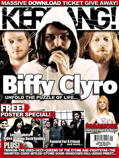
Above: Front Cover of Kerrang Magazine
The ideology of another music magazine - Rave - is that they want to promote parties - which is evident from their front cover of Fergie jumping out of a cake - and events which are going on in the music industry. This is related to name of the magazine being 'Rave'. The image of Fergie jumping out a cake, promotes the idea of wild parties or 'raves'.

Above: Front Cover of Rave Magazine
Mock College Magazine Contents Page

Above is what I have designed for a college's magazine's contents page. I have used Deyes High School as the school which the page is made for. I have used all the typical features of a contents page on my mock-up, including the contents panel (on the left hand side) which directs readers to stories they are interested in, and a 'Notice from the Head' section. This is similar to the 'Message for the Editor' section found in many magazines. The contents page also, follows a colour scheme of blue, black, white, and red, and also has a universal font, which is used for all the text on the page - this font being 'Georgia'.
Mock College Magazine Double Page Spread

I have designed my double page college magazine spread mock-up, so that it resembles a typical magazine/newspaper article. I think that this style of page gives the reader more information on the topic which they are reading about. I have used columns for the text because they are typically found in the style I was going for - magazine/newspaper like. Where the pictures are positioned on the page also reflects the look which I have chosen for the double page spread - in columns.
Moodboard
A moodboard is a poster showing a collection of images, texts, and samples of objects. It is a visual aid which is used in the planning process for a magazine. It is often used as a way of showing other people where you want your magazine to go - it shows them which artists will be in your magazine, and gives them an idea of what the genre you have chosen is all about.

My mood-board shows that I am making a magazine based on music which is currently in the charts (i.e, UK Top 40). People like Pink, Katy Perry, Lady Gaga, and Britney Spears amongst others are all people who are related to this genre of music.


Sunday 13 February 2011
College Magazine Analysis
In my media lesson, we analysed two college newsletters. We analysed them for the features of newspapers/magazines which we had learned in a previous lesson, which can be found on the magazine terminology post in this blog. We analysed two newsletter front covers - one from Deyes High School in Maghull, and the other from St Ambrose Barlow High School in Netherton.

The first newsletter front cover we analysed was the Deyes High School one. The Deyes High newsletter had both good points and bad points about its design. A good point about its design is that it is 'straight to the point' and clear. Looking at the newsletter's text (the title, and dateline) you can clearly identify the purpose of the newsletter. The font chosen also helps to give it, the clear look. Also on the text, the phrase 'Specialist Science College' is located below the main title. The word 'specialist' makes the school look respectable, and also makes it look like its a good choice for parents to choose for their child. The word 'specialist' in part of the larger phrase 'specialist science' - this is alliteration. Alliteration has been used, so the phrase stays in your mind, and Deyes High stays a good choice for parents to send their child/children too. These are the good points about the newsletter. As well as having good points in its design, and text, there are also some bad points about the design. One bad point is the font used in the text. The font used for the name of the school, and the school's motto - Specialist Science College', is not the same as the font used for the issue number and dateline at the bottom of the page. The font used for the dateline and issue number is called 'Comic Sans', but as the font above is not the same there is no consistent house style in the newsletter. Another bad point about the newsletter is the image which is used at the top - the black and white photograph of Deyes High School. No colour is used on the photograph, and it is quite old, and needs updated. The lack of colour though is not something which is confined to just the photograph though; the entire newsletter lacks colour. As the photograph though has not been updated, and lacks colour, the school looks old-fashioned, and not forward-looking - which is not a character the school wants to show.

The second newsletter cover we analysed was the St Ambrose Barlow one. Like the Deyes High School newsletter, there is both good and bad points about its design. Firstly, I will talk about the good points. A good point about the St Ambrose Barlow newsletter is that it uses colour. Colour makes the newsletter more attractive to read, and makes the school look forward-looking. Another good point about the St Ambrose Barlow newsletter is has a variety of features of magazine terminology - such as the tag, at the bottom-left of the newsletter, and the contents panel, along the left hand side of the newsletter. These are good features because they attract the reader to look inside, and the contents panel especially can direct readers straight to stories which they are interested in. The dateline, and issue number is good too, as they are hidden in the top-right in the masthead. The dateline and issue number being located here, makes the newsletter look very professional. The front page article itself looks like a newspaper article, because it has a byline, a lead story, and images with captions. This is also another good point because it makes the newsletter once again look professional. Although the newsletter has good points though, it also has bad points. The bad points include the font - Comic Sans, which is over-used on education documents, and the number of items actually on the front page - the density. Firstly, the font which is used for the masthead title, and the title of the lead story is Comic Sans. Comic Sans is a front which is over-used on education documents, and it becomes tacky and clique for a school newsletter. The other bad point about the St Ambrose Barlow newsletter is the density of the page itself. The page has multiple things on it, like the lead story, the tag, the contents panel, and the school's name, slogan and logo, amongst other things. I think that the number of things on the front cover make it too dense, which is something not found on the Deyes High School newsletter which is very minimalistic. These are bad points and good points which I found about the newsletter from St Ambrose Barlow High School, in Netherton.
Thursday 10 February 2011
Semiotic Theory
In our media lesson we learned about a theory called 'Semiotic Theory'. 'Semiotic Theory' was created by a man called Saussure, who found that the human brain analyses' pictures and colours, and then decided what the overall message of something is.
Saussure decided that there were three things which allow us to decide on a piece of media. The three things work as shown below -
a sign (maybe a colour or an object) + a signifier (maybe a piece of music or dialogue) = a signified process
An example on how this theory works is as follows - if it was raining outside (a sign), and somebody was listening to moody music (a signifier), then what is signified as a result would be depression and death. Another example of this theory would be - if it was sunny outside (a sign), and somebody was listening to pop/ chart music (a signifier), then your brain would see as a result happiness, and enjoyment.
For my music magazine, I am going to look at chart music (music which is currently on the UK Top 40). To do this, I am going to use bright colours, and an image of an artist who is currently in the UK Top 40 (although I am not sure yet which artist it will be).
Wednesday 9 February 2011
Theory - Feminism in the Media
From a feminist's persceptive looking at the media, feminists would see most of the media output as being the product of a patriachal society (or male dominated society) which is aimed at disempowering women.
Feminism was a responce to the idea that women are lower down socially than men. Until feminism, women were treated as objects by their male counterparts. The feminist movement, streched as from back as the 18th century, through to the Suffragette movement in the 20th century. Later the movement transformed itself into the 'Land Girls' movement which took place after the war, when women filled the jobs usually filled by men.
In the 1970s, equal oppotunites, and women's liberation caused great unrest and upheval with many groups in the society. In 1975, the 'Sex Equality Act' was passed in England, which forced employers to pay their female employees, the same as their male ones.
Academic feminism was a responce to feminism activists. Laura Mulvey's theory called 'Male Gaze' is the most accurate contemporary feminist text - it describes women's roles in the media and in society.
Mulvey's argument is that cinema audiences look at films in two ways:-
1. Voyeuristically
2. Fetishistically
Cinema audiences watch a film without being watched by the film's characters. The film is watching usually in a darkened room, so the audience members cannot see them. Therefore we are almost voyeurs, watching the people on screen, can lead to two effects.
1. Objectification - of female characters in relation to this controlling male gaze
2. Naristicism - with an ideal image seen on screen (Narcissitic identification).
Voyeurism
She argues that the voyeurism involves turning the represented figure into a fetish object so that it becomes increasingly beautiful.
Fetishism
Fetishically-looking, she suggests, lead to the cult of the female movie star, celebrated for her looks but considered as an object and often treated as such.
Roles of Men and Women
(1)Conventional Hollywood films have a male protoginist in the narative, and assume a male audience.
(2) Male actors are active and dynamic and not always conventionally attrtactive.
Feminism was a responce to the idea that women are lower down socially than men. Until feminism, women were treated as objects by their male counterparts. The feminist movement, streched as from back as the 18th century, through to the Suffragette movement in the 20th century. Later the movement transformed itself into the 'Land Girls' movement which took place after the war, when women filled the jobs usually filled by men.
In the 1970s, equal oppotunites, and women's liberation caused great unrest and upheval with many groups in the society. In 1975, the 'Sex Equality Act' was passed in England, which forced employers to pay their female employees, the same as their male ones.
Academic feminism was a responce to feminism activists. Laura Mulvey's theory called 'Male Gaze' is the most accurate contemporary feminist text - it describes women's roles in the media and in society.
Patriachy - a society ruled by men, through the figure of the father (patriach), and everyone else is subordinate. A patriachal society would have men dominating the media, which as a consequence media is contrusted amongst exclusively for men.
Mulvey's argument is that cinema audiences look at films in two ways:-
1. Voyeuristically
2. Fetishistically
Cinema audiences watch a film without being watched by the film's characters. The film is watching usually in a darkened room, so the audience members cannot see them. Therefore we are almost voyeurs, watching the people on screen, can lead to two effects.
1. Objectification - of female characters in relation to this controlling male gaze
2. Naristicism - with an ideal image seen on screen (Narcissitic identification).
Voyeurism
She argues that the voyeurism involves turning the represented figure into a fetish object so that it becomes increasingly beautiful.
Fetishism
Fetishically-looking, she suggests, lead to the cult of the female movie star, celebrated for her looks but considered as an object and often treated as such.
Roles of Men and Women
(1)Conventional Hollywood films have a male protoginist in the narative, and assume a male audience.
(2) Male actors are active and dynamic and not always conventionally attrtactive.
Media Vocabulary
Buzz Words - "Wow", "Exclusive", "Free", all examples of buzz words.
Puffs - Colourful boxes on the front cover, which promote features inside the magazine.
Strap Line - a slogan
Copy - This is the main story in the magazine.
House Style - A magazine's distinctive design that distinguishes it from its competitors.
Banner - This is the text that stands out on a coloured background generally at the bottom of the magazine.
Anchorage Text - This is the way that text pins down the meaning of a picture and vice versa.
Pugs - These are placed in the top right and left hand corners of the magazine, or newspaper and are called the "ears" of the page. Other things which can be positioned here include - the price of the paper/magazine, the logo of the paper/magazine, or sometimes a promotion.
Motto - This is a memorable phrase which is recognisable to a brand.
Headline - This is a catchy title for the magazine/newspaper's main article.
Sell Lines - Text on the front cover, which helps sell the magazine/newspaper to the audience.
Caption - The description of the newspaper/magazine's main image.
Masthead - The area normally located at the top of the magazine/newspaper which contains the name of the publication, and sometimes a dateline.
Lead - This is the introductionary paragraph of an article, which is usually written in bold or capitals to stand out.
Drop Capitals - This is the really big letter which starts off an article.
Tuesday 8 February 2011
Cohen's Moral Panic Theory
Cohen's Moral Panic is when a condition, episode, or groups of people which are a threat to society. Normally it's people in power who say what is threat - people like politicians, bishops, and the media. The theory says we take groups, like MPs and immigrants and turn into villains in the media. The media then will turn these groups into "folk devils" which makes people want the government to control these groups. In the UK, the BBFC classifies movies, as movies are evil in the media - e.g. certificates, 12, 15, 18 etc. (and MPAA in the United States).
Folk devils only appear when the ruling class are in trouble. E.g, when the country was falling into bankruptcy, the media decided to focus on benefit cheats, and the MPs expenses scandal. Below are examples of 'folk devils' in different periods in British history.
Victorian Britain > Musicals > Immorality
100 Years Ago > Football > Hooliganism
1890 > Bicycles > Cause of Chaos and Terror
1950's > Rock 'n' Roll > the 'Negro's Revenge', 'Devil's Music'
198o's > Video Nasties > Home Videos
1990's > Video Games > games like Grand Theft Auto encourage violence and crime
2000's > Internet > Social Networking
Friday 28 January 2011

Friday 21 January 2011
Music Magazine Questionnaire
Please click on the link to answer my questionnaire: - https://spreadsheets.google.com/viewform?formkey=dFhhQTJfM1B4b2ZOV3ZhWmhRVjJCd2c6MQ
Subscribe to:
Posts (Atom)